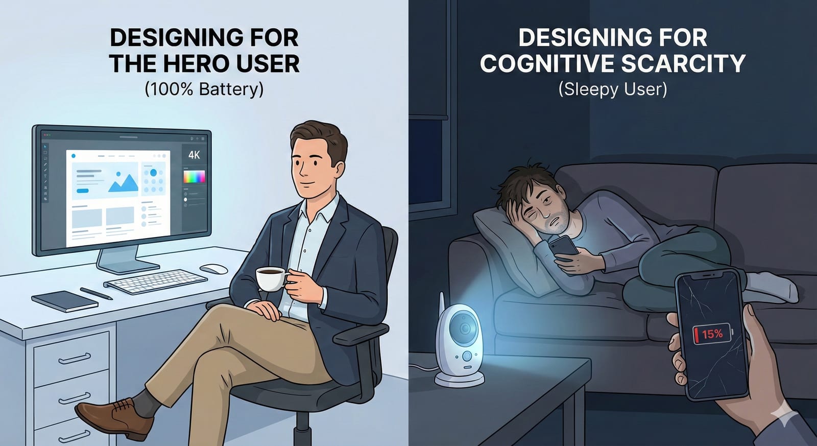
Every interface has an imagined user standing behind it. Call them the Hero User: a well-lit desk, a cup of coffee, a stable fiber connection, fully rested, emotionally regulated, reading every line of text on the screen. The Happy Path is the path that person walks.
The real user arrives on the “Sleepy Path.”
They are operating on 15% battery — biologically and technologically. They are scrolling one-handed while holding a crying baby, standing on a crowded train with spotty signal, or trying to pay a bill at 1:00 AM while panicked.
This is Cognitive Scarcity: a temporary drop in mental bandwidth caused by stress, fatigue, or distraction. The words scarcity, bandwidth, and tunneling come from Sendhil Mullainathan and Eldar Shafir’s Scarcity (2013), which studies what a shortage of money or time does to attention; I use them loosely, for any low-bandwidth moment. HCI research calls this situational impairment.
When you design for the Hero User, you build fragility. When you design for the Sleepy User, you build resilience.
Pattern 1: The Session Timeout
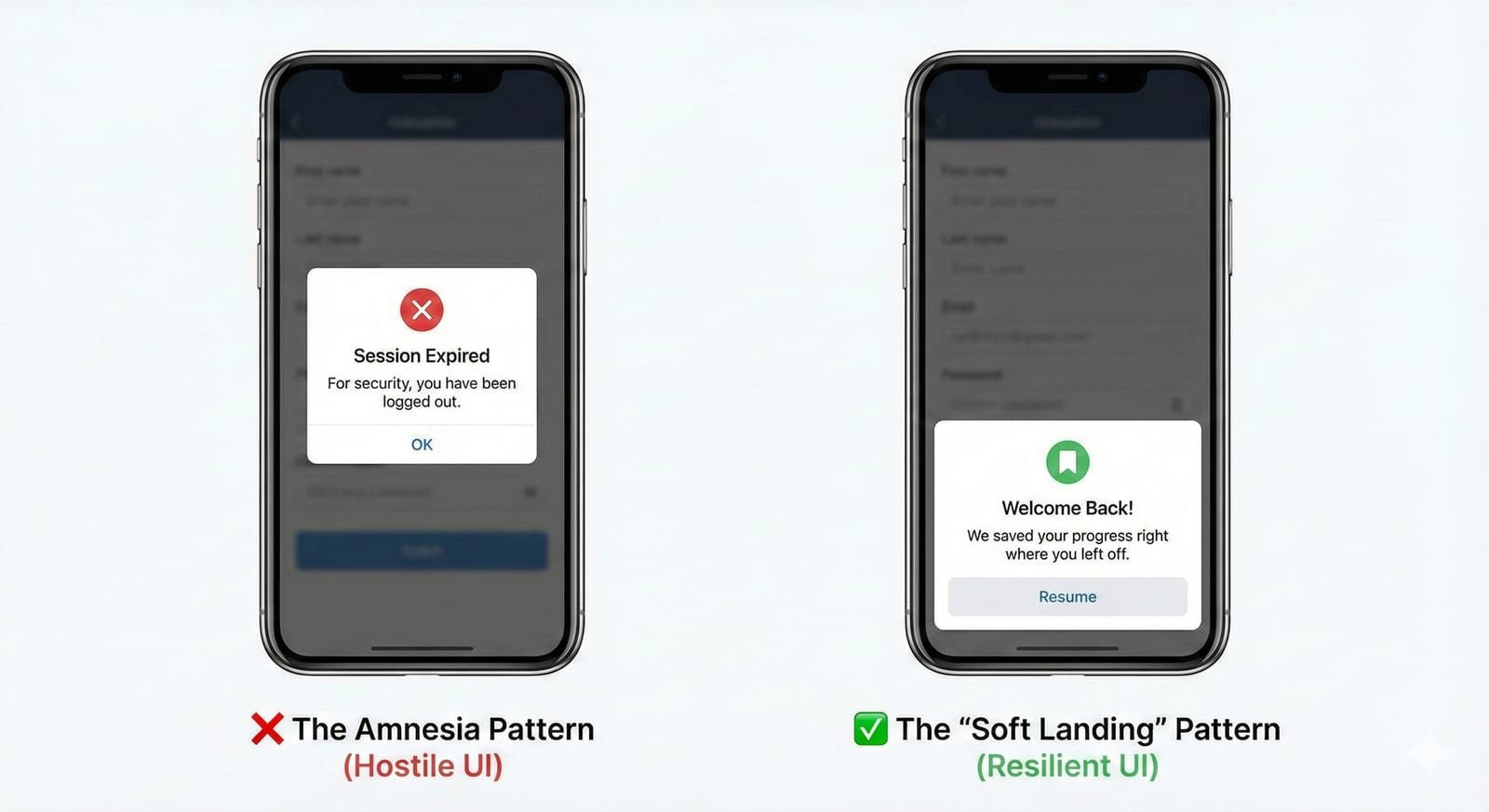
The Amnesia Pattern vs. the Soft Landing Pattern. A user gets halfway through a complex application (insurance, taxes, housing) but gets distracted by real life. They return 20 minutes later.
| Hostile UI | Resilient UI |
|---|---|
| The standard timeout protects the account on an unattended device, and throws away the user’s work along with the session. A cold modal stating "Session Expired." When the user clicks "OK," they are booted to the login screen. Their data is wiped. They quit. | The "Soft Landing" pattern assumes the distraction was involuntary. A warm modal stating "Welcome back. We saved your progress." The user taps Resume, signs back in if the session requires it, and the screen restores exactly to the field they were editing. |
Pattern 2: The Critical Error
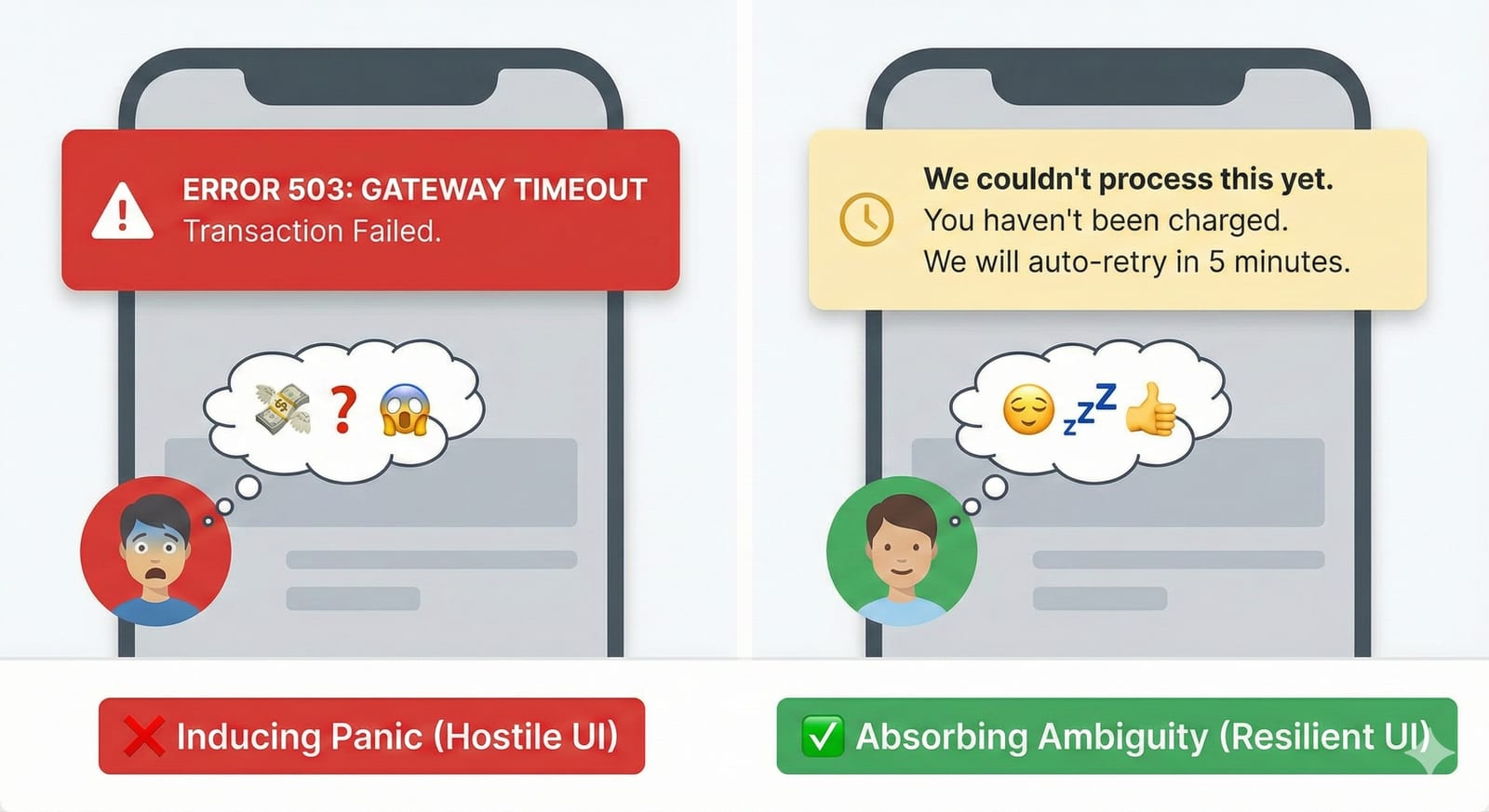
Inducing Panic vs. Absorbing Ambiguity. A payment request times out or a sync breaks. The system needs to inform the user that a process did not finish.
| Hostile UI | Resilient UI |
|---|---|
| A red banner reading "Error 504: Gateway Timeout." The user thinks: Did I lose my money? If I click it again, will I be charged twice? I don’t have time to call support. | A yellow banner reading "We’re confirming this payment. You won’t be charged twice. We’ll update you in 5 minutes." After a timeout the system does not know whether the charge went through, so the banner says it is checking, rules out a double charge, and commits to a time. The user thinks: Okay. I don’t need to click again. I can go to sleep. |
Pattern 3: The Destructive Action
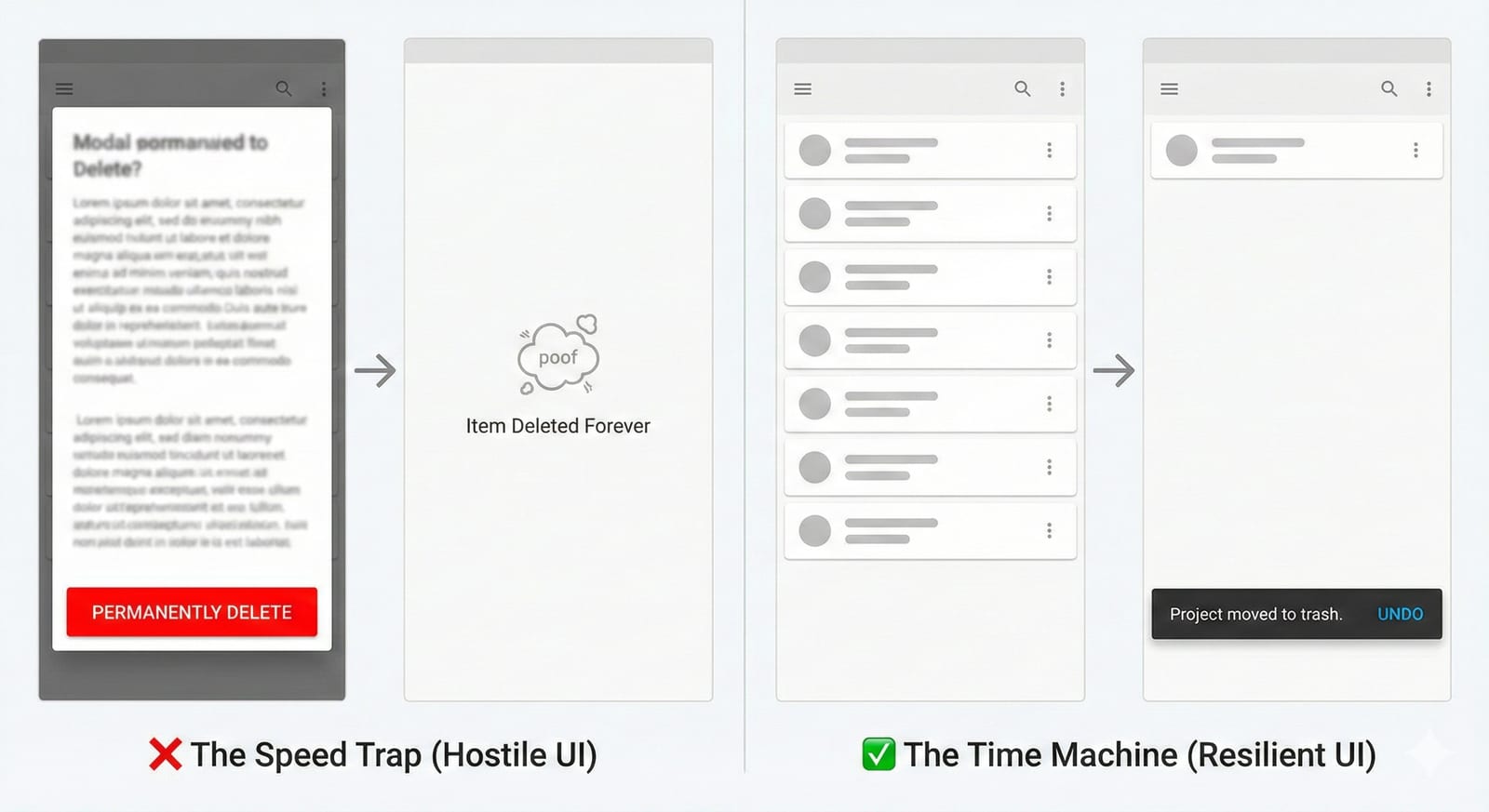
The Speed Trap vs. the Time Machine. The user hits a button that destroys data (Delete Project, Cancel Subscription, Remove User).
| Hostile UI | Resilient UI |
|---|---|
| A modal asking "Are you sure? This cannot be undone." Confirmation dialogs train people to click through them. After enough of them, a sleepy user sees a modal, finds the bright red button, and clicks it without reading the warning. | The item disappears immediately, but a toast notification appears: "Project moved to Trash. [Undo]" Aza Raskin made this case in "Never Use a Warning When You Mean Undo" (2007). The principle: never demand perfection from a tired person. |
Pattern 4: The Login Loop
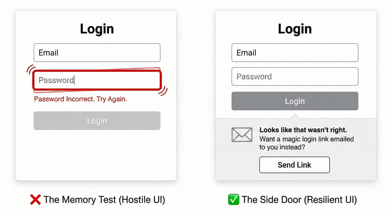
The Memory Test vs. the Side Door. The user is trying to log in on a new device but can’t remember their password.
| Hostile UI | Resilient UI |
|---|---|
| A shaking text field saying "Password Incorrect. Try Again." The user tries three variations, gets locked out, and churns. | After one failed attempt, the UI expands: "Looks like that wasn’t right. Want us to email you a login link instead?" The principle: when the front door is stuck, open a side door. |
The Designer’s Checklist for Low Energy
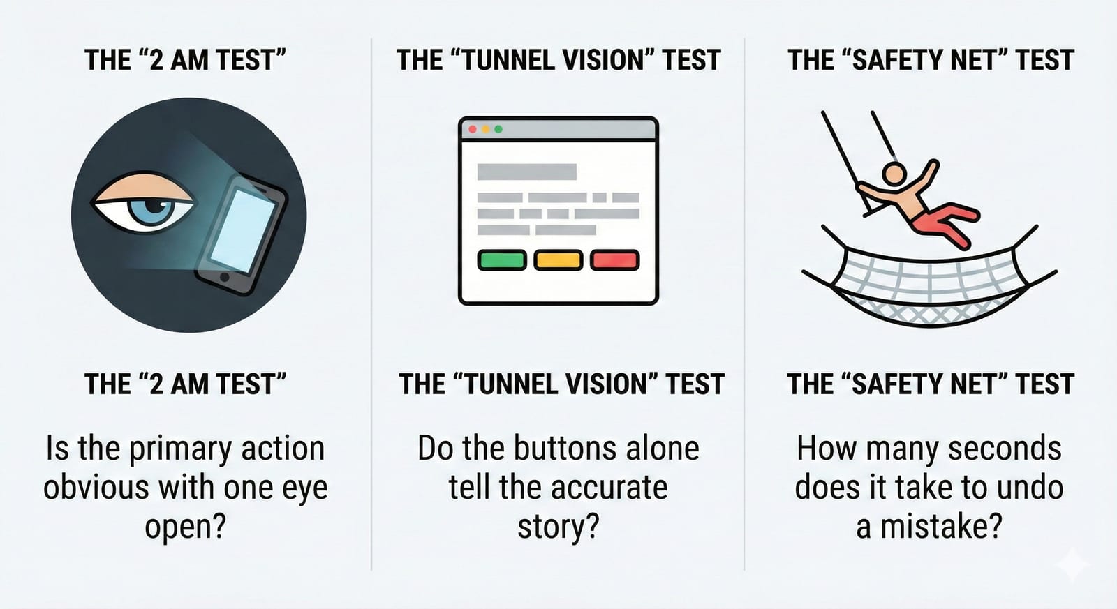
Three questions to stress-test a flow against:
- The “2 AM Test” — If I looked at this screen at 2:00 AM with one eye open, is the primary action obvious? Or do I have to read a paragraph to understand what to do?
- The “Tunnel Vision” Test — Sleepy users ignore grey text. If I remove all the helper text and subheaders, do the buttons alone still tell the accurate story?
- The “Safety Net” Test — If I tap the wrong button by accident, how many seconds (and how many clicks) does it take to fix it?
Attention is a finite resource, and most interfaces spend it as though it were free.
Corrections
- 7 October 2026: this essay said “This is Cognitive Scarcity” without saying where its terms came from. Scarcity, bandwidth, and tunneling are Mullainathan and Shafir’s terms for what a shortage of money or time does to attention, and the essay now credits them and says it uses them loosely.
- 7 October 2026: this essay said “the standard security pattern prioritizes the database over the human.” A session timeout protects the account on an unattended device; the hostile part is throwing away the user’s work.
- 7 October 2026: this essay’s resilient payment banner said “Don’t worry, you haven’t been charged. We will auto-retry in 5 minutes.” After a timeout the system does not know whether the charge went through, so that promise could be false and the retry could charge twice; the banner now says the payment is being confirmed and rules out a double charge.
- 7 October 2026: this essay said users click the red button “before their prefrontal cortex registers the warning.” The mechanism is habituation: confirmation dialogs train people to click through them without reading.